Eweburn Creek
Rebranding Process & Collatoral
In September, we refreshed and updated the previous logo, taking full creative control throughout the process. Drawing inspiration from various sources, we communicated our vision clearly to the creative team to ensure the final design matched our imagined concept. From branding colors and fonts to the background and the logo itself, we considered every detail and worked closely with the team to bring the idea to life.
Intro
Eweburn Creek is a modern but timeless brand with everyday functionality. Pieces that are not only beautiful, but built to last.
Vision
To create high-quality threads that combine aesthetics, comfort and durability.
Mission
To become a leading name in modern knitwear recognised for sustainability and timeless fashion, that shapes how people express themselves.
Story
We understand that your brand is deeply connected to your family’s history on the sheep and beef farm near Ranfurly. With a background in Fashion Design from Otago Polytechnic and a focus on sustainability, the business created a range of versatile clothing made from locally sourced mid-micron wool.
The use of a Merino and Border Leicester wool blend highlights the quality and durability of the products, while promoting eco-friendly practices. This clear commitment to both heritage and sustainability is reflected throughout the business brand and informed our design approach.
Core Values
The business is dedicated to producing high-quality, sustainable wool products that combine tradition with modern design. Every day, the team focuses on sourcing premium mid-micron wool locally and crafting versatile, durable clothing that meets the needs of environmentally conscious consumers. Their success lies in maintaining a strong connection to their farming roots while delivering products that embody comfort, style, and eco-friendly values.
Looking ahead, the business aims to grow its reach by continuing to innovate within sustainable fashion, expanding its product range, and strengthening customer relationships. By staying true to their commitment to quality, authenticity, and environmental responsibility, they plan to achieve their vision of becoming a leading brand recognised for sustainable, premium wool fashion.
Explanation
This new design concept was created from the ground up with a clear focus on expressing the essence of the brand. It features a single-line illustration forming a sheep silhouette, with the line work intentionally highlighting the wool as the main visual feature. The wool is placed front and centre because we understand it’s the core reason customers choose the brand, it represents the quality, authenticity, and uniqueness that defines the business.
This approach results in a concept that is simple yet distinctive; the single-line style feels handcrafted and organic, mirroring the natural essence of the products. Its elegant execution not only elevates the overall aesthetic but also clearly communicates what the brand stands for and why it resonates with their audience.
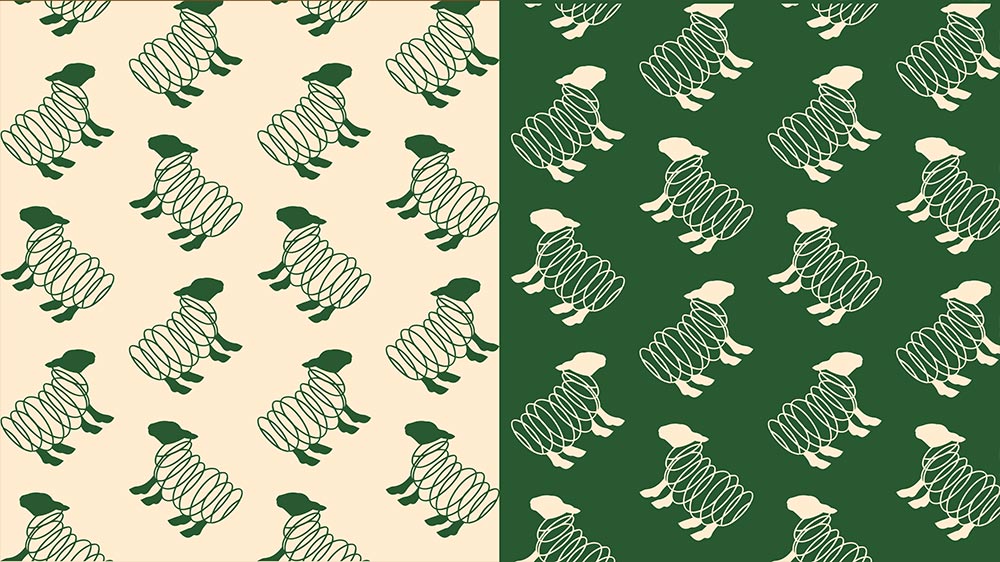
This new design concept has been developed from scratch to capture the core identity of your brand. It features a stylised sheep silhouette, where the head and legs are more dominant and bold, giving the design a strong and confident presence. Surrounding this, the wool is illustrated using elegant, single-line circular forms, placing clear emphasis on the material that defines the products. This not only reflects the clean, high-quality wool the brand is known for, but also creates a sense of movement and softness. The contrast between the bold structural elements and the flowing linework of the wool results in a balanced, visually striking mark. Overall, the design feels handcrafted and natural, clearly communicating the premium quality, authenticity, and purpose behind the products in a clean, elegant, and memorable way.
The Bold-Leg/Head Version – In this version, the head and legs are bolder and more grounded, giving the logo a sense of strength, character, and stability. This represents the reliability and trusted quality of the wool. The wool is still expressed through elegant single-line circles, reminding us that while the foundation is strong, the product remains soft, clean, and premium.
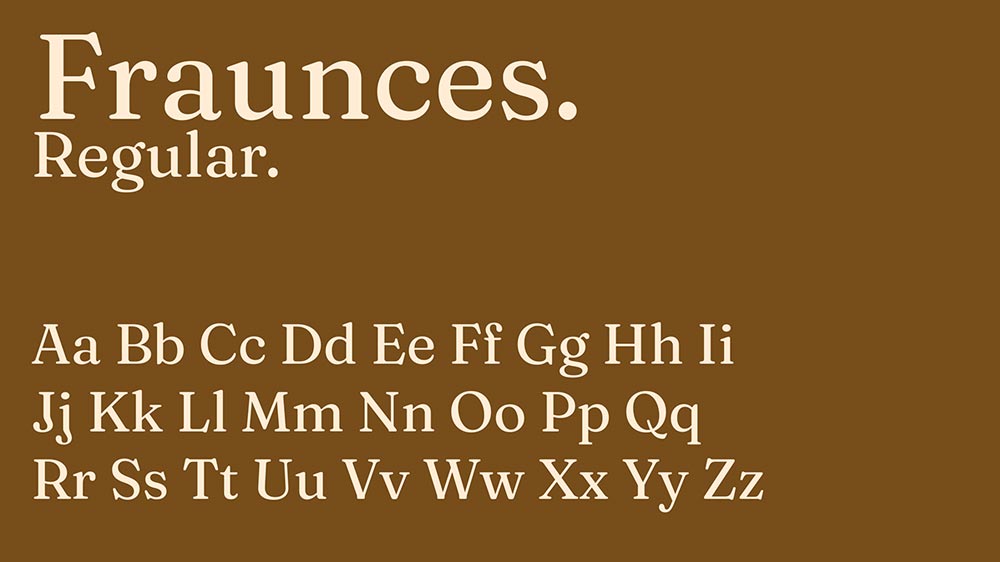
Typography
We believe this font combination should be used because it perfectly aligns with the brand identity by balancing readability with timeless elegance. It showcases the high-end, classic, and sophisticated qualities they wanted to be known for, while remaining clear and easy to read across all applications. Additionally, the distinctive style of Fraunces makes it strong enough to work as a standalone logo, much like the competitors effectively use their typography. This versatility ensures your brand remains recognisable and polished in every context, reinforcing your premium positioning and heritage while bringing that country look.
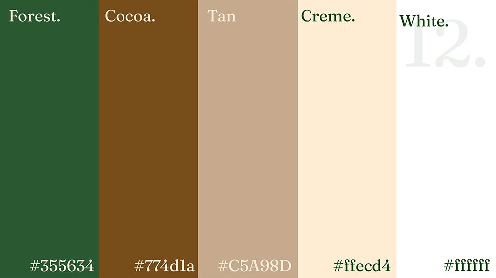
Colours
Together, these colours create a balanced and organic visual identity that mirrors your brand values and forges a meaningful connection with customers who appreciate natural, honest, and beautifully made products sourced directly from the farm.
Collatoral
This pull-up banner we designed and also used in one of the paid ads we organised. We organised the people who made the pull-up banner and got it sent to us.
The producers who made the pull-up banner also executed our design, and we coordinated it before the field day event held in Christchurch, called the Christchurch Show. This banner had a QR code at the bottom that we made, which led people to social media and the website.
This pull-up banner was a success. After talking to our client and attending the field days, we saw and heard people saying they loved the new brand and its look and feel. The pull-up banner brought people in, sparking interest to look more in depth at the products.
The banner gave people knowledge and interest without direct communication, and if they were interested, they looked into it.
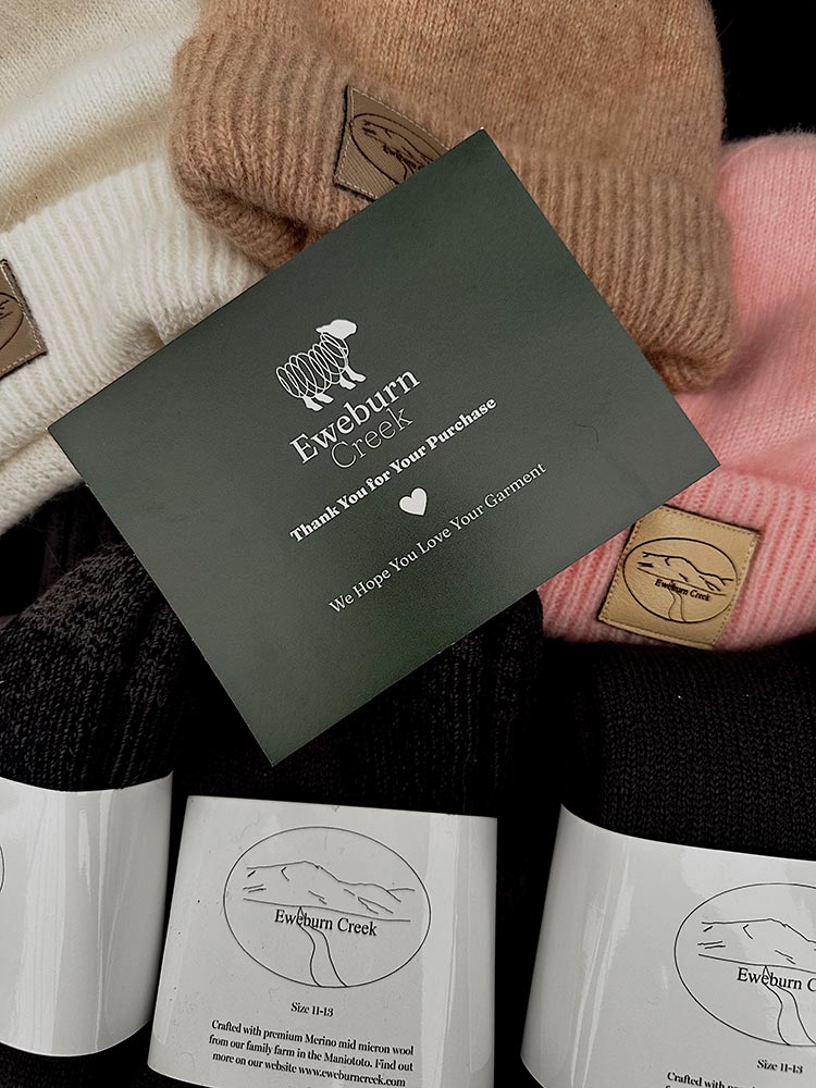
Thank you card
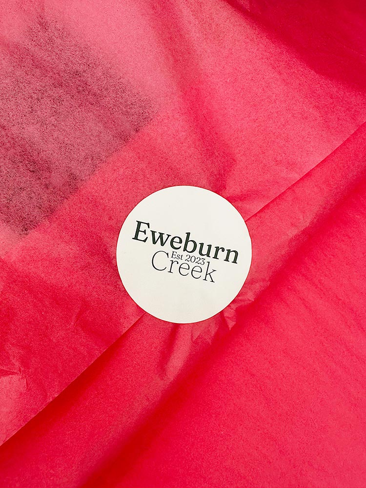
Branded stickers
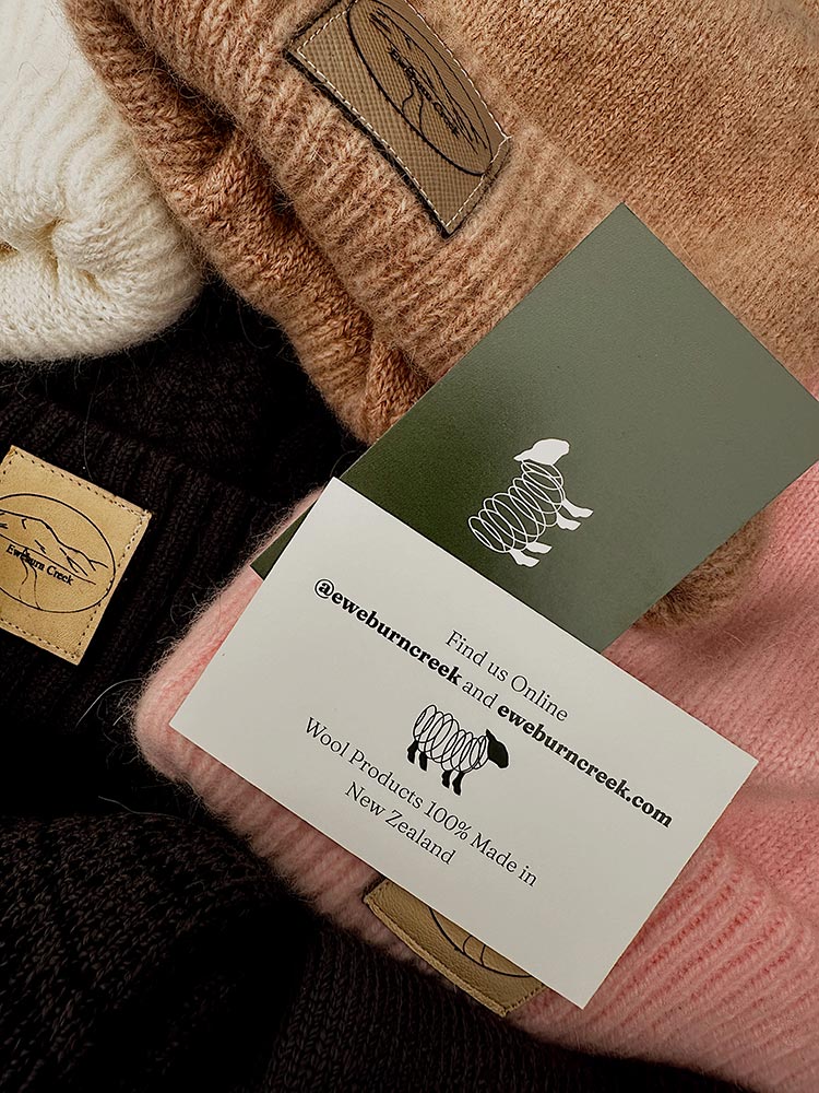
Business cards
Above are pictures we designed and organised for the Field Days. The client didn’t have any branded business cards, tissue paper, stickers, or thank-you cards, so when people purchased from the website or on-site at the Field Days, there wasn’t a clean, professional, branded experience where people could see where they were shopping. This caused the brand to be lost in real time. Above, you can see the collateral we designed and organised to fix this.